

Device OEMs and carriers spent much of 2025 positioning AI as the defining reason to upgrade. On-device intelligence, Smarter cameras, Conversational assistants baked into the operating system. The marketing spending behind those messages was substantial. The consumer response, measured in actual purchase decisions, was not.
According to Recon Analytics’ US Consumer Device Purchase Journey — Part 2: Purchase Drivers and Feature Priorities, which tracked purchase behavior across more than 104,000 US respondents from May through December 2025, hardware failure was the single largest purchase driver for every brand tier in every single month of the tracking period. The range ran from 5.6 percent to 13.2 percent across brands, depending on the month. AI feature priority, by contrast, peaked at 5.1 percent for Motorola in December, with Samsung Non-Flagship nearly tied at 5.0 percent in the same month, while Apple and Samsung Flagship were at 4.5 percent and 2.8 percent, respectively. Performance and battery life combined accounted for 27 to 30 percent of feature selections throughout the period. The industry’s marketing story and consumers’ actual motivation have rarely been further apart.
Broken Phones Drive More Sales Than New Ones Do
The report’s most structurally important finding is also its simplest: new model launches do not generate demand. The ‘new model available’ driver accounted for just 1.1-4.6 percent of purchase decisions across brand tiers, the smallest driver in the entire dataset. Hardware failure drove purchases at rates typically two to six times higher across most brand-month combinations, with the gap widest among value-tier brands. Consumers replace devices primarily because their current one no longer functions, not because a shinier one arrived in a press release.
That distinction matters enormously for how carriers and OEMs plan their promotional calendars. Forced-replacement buyers cannot defer. They accept the best available offer when they need a device, not when a manufacturer wants them to buy one. Treating that demand pool as if it were promotion-responsive misreads its urgency structure, and likely leaves margin on the table.
Table 1.1: Device Stopped Working — Forced Replacement Cycle, May–Dec 2025

Source: Recon Analytics US Mobile Device Components Survey.
The data also reveals a counterintuitive finding about hardware quality that runs counter to the value-segment narrative. Budget devices do not just cost less; they wear out faster. As Table 1.1a shows, Motorola users hold their phones for an average of 1.88 years, the shortest tenure in the dataset, yet their average failure rate is 10.7 percent. Samsung Flagship users hold their devices for an average of 2.62 years, the longest tenure of any tracked brand, and register a failure rate of just 8.1 percent.
Table 1.1a: Estimated Average Device Tenure by Brand, Q4 2025

Source: Recon Analytics US Mobile Device Components Survey.
Premium hardware withstands extended ownership better than budget hardware, consistent with patterns observed throughout the study period. Apple users average 2.24 years of device tenure and register the lowest failure rate in the dataset at 7.9 percent, confirming that the tenure-failure inversion holds across both premium tiers. Motorola’s 9.2 percent fresh-acquisition rate, the highest among tracked brands, is not evidence of strong organic demand. It is the downstream consequence of a replacement cycle that restarts sooner due to the original hardware degrading faster. That is a structural ceiling on how much margin any promotional strategy can recover in the value segment.
The Carrier Calendar Runs the Market
If hardware failure drives those who replace their device, carrier promotional calendars drive when they do it. The seasonal signature for promotional offers—July peaks for back-to-school, August troughs as campaigns close, and November-December rebounds around Black Friday —appeared in lockstep across all five brand tiers tracked in the study: Apple, Samsung Flagship, Samsung Non-Flagship, Google/Pixel, and Motorola. Five tiers with entirely different products, price points, launch windows, and marketing strategies, all moving in the same seasonal rhythm.
The most parsimonious interpretation is that OEM launch timing does not govern purchase decisions at the market level. It is the carrier promotional calendar operating as a shared timing mechanism across the entire industry. OEMs that plan demand forecasts primarily around their own launch events are possibly treating a secondary driver as the primary one.
Software update obsolescence is the one driver that offers a genuine structural advantage to carriers and OEMs willing to exploit it. Running at roughly half the rate of hardware failure, 2.6 to 6.2 percent across the period, update-obsolescence buyers are the most forecastable pool in the market. End-of-support dates are published in advance. The affected device population is identifiable by model. The replacement decision, once support expires, is non-discretionary. Carriers with visibility into device models on their networks can reach those buyers three to six months before the end-of-support date, ahead of competitive search, with an offer calibrated to urgency. No other driver in the dataset offers that combination of predictability and addressability.
Google’s Numbers Tell a Different Story Than They Appear To
The Pixel data in this report is the most analytically complex and the most instructive for understanding how launch-dependent demand differs from organic demand.
Google’s purchase driver and feature priority metrics exhibit a consistent trough pattern in May and August, which appears in every table in the report. May’s lower readings reflect Pixel 9a launch dynamics: a-series buyers who purchased at general availability are newer-device holders with less accumulated hardware frustration and weaker brand motivation than the core Pixel base. Their inclusion in the May survey pool dilutes urgency metrics across the board. Google’s May failure rate of 6.8 percent and August reading of 5.9 percent are the two lowest in the Google series for exactly these reasons.
August is more complicated. The buyers who responded most urgently to July’s concentrated promotional activity had already converted by the time August surveys ran. Google’s July failure rate hit 13.2 percent, the highest reading for any brand in any month, as long-tenure Pixel 9-era holders reached their breaking point. Then it collapsed to 5.9 percent in August. The 95 percent confidence intervals for those two months, July [11.6%, 14.8%] and August [3.9%, 7.9%], are non-overlapping (z = -5.61), confirming that this is a compositional shift rather than sampling noise. On top of that, the Pixel 10 launched on August 28, meaning brand-motivated upgrade buyers were in a pre-purchase holding pattern for 28 of August’s 31 days. They showed up in September.
The result is that Google’s battery priority dropped by 9.9 percentage points from July to August, the largest confirmed metric swing across all ten feature categories in the dataset. Google’s brand reputation reading hit 2.9 percent in August, the series nadir, then recovered to 7.4 percent in December, the highest reading in the Google series and among the highest readings of any brand in any month during the study period. Both numbers are real. Neither is representative of Pixel’s underlying demand dynamics. Carriers and analysts reading Google’s monthly metrics without accounting for these structural troughs will systematically misread the brand’s actual competitive position.
What the Replacement Pipeline Looks Like Entering 2026
The demand picture for 2026 is governed less by any specific promotional campaign or AI feature rollout than by tenure and hardware degradation operating across a large installed base.
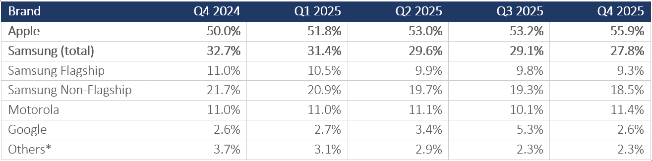
Samsung Flagship enters 2026 with 64.4 percent of its installed base in the two-plus-year upgrade window, the highest upgrade-eligible share of any brand, consistent with its 2.62-year average tenure. Apple’s 51.8 percent upgrade-eligible share, applied to its 55.9 percent installed-base share, produces the largest absolute pool of replacement-ready consumers in the market. Both pools are motivated primarily by performance and battery urgency, with carrier promotional offers providing the timing trigger rather than the underlying motivation.
Feature priorities tell a consistent story across the entire study period. Performance and battery lead every brand tier every month. Camera and storage form a durable secondary tier. AI feature priority, despite 12 months of industry marketing, remains below display quality and well below the hardware fundamentals that have driven replacement decisions for the better part of a decade. That gap may narrow as on-device AI capabilities mature and differentiate more visibly in daily use. Whether AI features will drive purchases in subsequent cycles as consumer familiarity grows is beyond the scope of this study, but nothing in the 2025 data suggests an inflection point is near. In 2025, according to the data, it had not narrowed yet.
The consumers replacing their phones in 2026 will mostly be doing it because something stopped working, or because a carrier made them a deal they could not ignore, or because their three-year-old Motorola finally gave up. This pipeline estimate assumes carrier promotional intensity and consumer credit conditions remain broadly consistent with 2025; a meaningful macro contraction or carrier subsidy reallocation toward broadband convergence rather than device promotions would compress conversion from the replacement-ready pool. The AI pitch may be the reason they choose one device over another at the moment of purchase. It is almost certainly not the reason they walked into the store.
Note: This report tracks completed purchase journeys. The survey captures US consumers who completed a device purchase during the study period. Consumers who considered upgrading but did not purchase are not represented in the data. The finding that AI features did not drive completed purchases is robust; whether AI features contributed to purchase deferrals cannot be determined from this dataset. This analysis covers US consumer purchases only. Enterprise procurement, trade-in program dynamics, and international markets are outside the scope of this dataset and may differ materially. Carrier-switching dynamics, including switching rates by brand tier and the role of competitive offers in driving net additions, are tracked separately and will be published in a forthcoming report in this series.
Recon Analytics’ US Consumer Device Purchase Journey report series, based on the Recon Analytics US Mobile Device Components Survey, covers more than 104,000 US respondents across five consecutive quarters from Q4 2024 through Q4 2025. You can find it here: US Consumer Device Purchase Journey – Part 2: Purchase Drivers and Feature Priorities