On July 28, 2026, Apple rolled out a new way to get an iPhone: a leasing program built with fintech Klarna, replacing its long-running Upgrade Program. It’s tempting to read this as Apple squaring off against AT&T, Verizon, T-Mobile, and the cable-affiliated carriers for the upgrade customer, but carriers remain Apple’s largest distribution channel by far, and Apple has little incentive to undercut the partners who sell most of its phones. The more useful lens: Apple and Klarna get paid every month whether a customer upgrades or not; that’s the baseline economics of any lease. But the product itself, down to its name, is built to make upgrading the easy default: fixed 12- or 24-month terms that force an active decision at renewal, with no balance to settle and no new credit pull to switch devices. Recurring payment is the mechanism; a shorter replacement cycle is the outcome it’s built to produce.

What Apple Actually Launched

Apple markets its new lease as “Apple Upgrade,” but to avoid confusion with the half-dozen other “upgrade” programs in this piece, this note just calls it the Apple lease. Using the iPhone 17 Pro 256GB ($1,099.99 retail) as the reference device throughout, it comes in two flavors: 24 months at $31.99/mo, or 12 months at $45.99/mo for a fresh phone every year. Either way, you never own the phone through this path; at term end you return it, buy it out, or roll into a new lease. Approval only requires a soft credit check through Klarna, a lower bar than a traditional installment loan, and Apple doesn’t care what plan you’re on, just that you keep an active postpaid line with AT&T, T-Mobile, or Verizon at signup. That postpaid requirement doubles as a second credit gate: postpaid service itself typically requires a carrier credit check, so Klarna’s soft check screens people who’ve already cleared one credit bar, not the general public. That doesn’t eliminate credit risk, and it’s too early to know Klarna’s approval or loss rates on a days-old program, but the risk is more contained, and more shared with the carriers already extending credit to the same customers, than it might first appear.

That plan-agnostic design isn’t Apple trying to poach plan upgrades. AT&T’s Next Up Anytime already works the same way. T-Mobile’s Yearly Upgrade and Verizon’s Flex Upgrade, by contrast, only unlock on premium tiers like Go5G Next, Experience Beyond, or an Unlimited-category plan, and the cable operators run the same playbook: Spectrum’s Anytime Upgrade requires Unlimited Plus, Xfinity’s equivalent requires Mobile Plus. Apple isn’t in the wireless-plan business, so it has no reason to gate the lease behind one, though it still requires picking a carrier. Plan-agnostic isn’t the same as carrier-agnostic, and Apple’s lease is only the former.

How the Math Works Out

Apple’s lease isn’t automatically cheaper, and it doesn’t need to be. Most upgrade programs run on forgiveness: pay down a chunk of the device cost, trade in a working phone, and the rest is wiped clean. Apple’s lease works differently and skips the trade-in requirement entirely: break it early and you owe the full remaining balance, typically covered with trade-in value but payable in cash too.

A quick note before the numbers: Table 1 isn’t a monthly bill. Each figure is the total device cost if someone walked away and upgraded at that checkpoint. Apple’s numbers repeat because there’s no partial forgiveness: breaking the 24-month lease early costs the same $767.76 at month 12, 18, or 24, and the 12-month lease simply restarts a full cycle every 12 months, so 18 months means two complete terms.

Table 1: Device Cost Comparison, Apple Leases vs. Operator Financing (excluding trade-in, mobile plan)

The carrier and cable figures come from each provider’s own installment length (36 months for AT&T, Verizon, and Spectrum; 24 months for T-Mobile and Xfinity) divided against the $1,099.99 retail price, plus that program’s fee. Apple’s own pricing has a subsidy-like effect too: the 24-month lease’s total payments land below retail price, so a lease customer pays less out of pocket than buying outright, with Apple and Klarna recovering the gap via the returned device or a buyout fee.

None of these numbers include what it costs to get in the door. AT&T, Verizon, T-Mobile, Spectrum, and Xfinity all require trading in a working device, typically worth $300 or more, to trigger forgiveness, and none of that value is credited in the table. Apple’s lease doesn’t require a trade-in at all. Spectrum’s and Xfinity’s cheapest figures also only apply on their top-tier plans, which cost real money: Unlimited Plus runs $40/mo and needs an active Spectrum Internet subscription, or a $10/mo surcharge without one; Xfinity’s Mobile Plus runs $45/mo. Neither recurring cost shows up above.

This table compares device financing only, holding trade-in and plan-tier questions constant so it’s apples-to-apples on that one dimension. It’s a fair single-column read, but not the whole bill.

The Adoption Hurdles

Three things stand in the way of the Apple lease catching on quickly, none about conflict with carriers.

First, it’s a harder sell. A carrier rep’s pitch is quick: device plan, add the upgrade fee, trade in whenever. Apple’s needs more steps: it’s a lease, not a purchase; pick the right term; no forgiveness if plans change; Klarna is the actual lender; and AppleCare+ is optional, at extra cost. That’s a lot to walk through at checkout.

Second, and more telling, the Apple lease is only available through Apple’s own channels, Apple Store and apple.com, not any carrier’s stores or websites. Recon Analytics’ consumer panel shows carrier stores and websites capturing roughly 83 to 90% of wireless purchasing preference, a share that’s climbed from about 83% in late 2023 to roughly 85% by early 2025 (n=59,920).

Source: Recon Analytics US consumer pulse survey (November 2023 to April 2025, n = 59,920).

Because the Apple lease lives inside that much smaller slice, its reach depends almost entirely on customers already planning to buy from Apple. Carrier reps aren’t overlooking it; they simply don’t carry it, a real ceiling on how fast this can scale.

Third, there’s an industry precedent worth taking seriously: getting devices back. Sprint’s leasing program, launched in 2014, generated real financial damage from customers who didn’t return devices or didn’t realize they were obligated to. SEC filings show write-offs tied to leased-device cancellations running into the hundreds of millions of dollars a year, adding up to well over a billion dollars in losses over the life of the program. Apple’s structure is cleaner, with fixed terms and an explicit end-of-lease choice rather than an open-ended plan, but the underlying risk of customers not returning a device they didn’t realize they only leased hasn’t been tested at Apple’s scale.

There’s a technical mitigant worth flagging. Code in the iOS 27 beta, reported by 9to5Mac, describes a “Restricted Mode” that lets a financing partner remotely lock a leased iPhone down to a bare app allowlist on missed payments, while subscriptions keep billing. A companion “Partner Finance Lock” would block erasing, reselling, or dismantling the device, even surviving a factory reset. 9to5Mac ties this to the Klarna partnership; it wasn’t in the iOS 26.6 release candidate, so treat it as directional rather than confirmed. If it ships, it’s a real answer to the Sprint problem: Sprint had no way to remotely disable or reclaim a device, and Apple appears to be building that capability into the OS itself.

What It Means for Carriers

Because a postpaid line with one of the Big Three is required to originate a lease through Apple, and no cable MVNO like Spectrum or Xfinity is an option at signup, AT&T, T-Mobile, and Verizon come out ahead here: every Apple lease customer starts as one of their subscribers. That line is only required to enroll, though; Apple’s enrollment terms specify the carrier requirement at signup but are silent on whether service must stay active for the life of the lease.

That’s where the unlocked device changes things. Once the phone ships, a customer can move between AT&T, Verizon, and T-Mobile without owing anything extra on the device, unlike carrier financing, where leaving mid-term usually means immediately owing whatever’s left. Because the phone isn’t locked to any network, that freedom extends beyond the Big Three too: the same customer can walk away to Spectrum, Xfinity, a prepaid brand, or any carrier that will take a SIM.

There’s a bigger upside than foot traffic, too. Device financing ties up carrier capital, creates credit exposure to the same customers they’re already billing for service, and generates collections and write-off costs. Handing that burden to Apple and Klarna, while keeping the higher-margin service revenue, could be a net relief rather than a loss. If the Apple lease also gets people upgrading more often, that’s more foot traffic and attach opportunities on top. Faster upgrade cycles and lighter balance sheets both tend to help carriers, not just Apple.

Who Actually Wins Here

For the lowest device-only cost on a 1-2 year upgrade cycle, Spectrum’s Anytime Upgrade and AT&T/Verizon’s Flex programs lead through month 18, once you factor in the required trade-in and, for Spectrum, the Unlimited Plus plan and internet subscription. Anyone who wants to own the phone by year two is better served by T-Mobile’s or Xfinity’s standard installment plans. For those who don’t want their device tied to a plan tier, Apple and AT&T are the real options, since T-Mobile, Verizon, Spectrum, and Xfinity all require a plan upgrade, and Spectrum a home internet subscription, to unlock their best deal. For anyone who doesn’t mind never owning the phone, would rather skip the trade-in, isn’t tied to a specific, especially premium, plan, and wants a new phone every 12 or 24 months, the Apple lease delivers that freedom at a lower price.

The Bottom Line

Apple’s lease isn’t built to take customers from carriers, who remain its most important sales channel by far. It’s built to shorten the time between upgrades and sell more phones, a goal carriers can largely get behind too, since they profit from device attach and service revenue either way. The real open questions aren’t about who wins a fight that isn’t happening. They’re about how quickly Apple can make this option easy to explain and easy to find, given how much of the upgrade decision still happens on a carrier’s sales floor rather than Apple’s own.


 

Device OEMs and carriers spent much of 2025 positioning AI as the defining reason to upgrade. On-device intelligence, Smarter cameras, Conversational assistants baked into the operating system. The marketing spending behind those messages was substantial. The consumer response, measured in actual purchase decisions, was not.

According to Recon Analytics’ US Consumer Device Purchase Journey — Part 2: Purchase Drivers and Feature Priorities, which tracked purchase behavior across more than 104,000 US respondents from May through December 2025, hardware failure was the single largest purchase driver for every brand tier in every single month of the tracking period. The range ran from 5.6 percent to 13.2 percent across brands, depending on the month. AI feature priority, by contrast, peaked at 5.1 percent for Motorola in December, with Samsung Non-Flagship nearly tied at 5.0 percent in the same month, while Apple and Samsung Flagship were at 4.5 percent and 2.8 percent, respectively. Performance and battery life combined accounted for 27 to 30 percent of feature selections throughout the period. The industry’s marketing story and consumers’ actual motivation have rarely been further apart.

Broken Phones Drive More Sales Than New Ones Do

The report’s most structurally important finding is also its simplest: new model launches do not generate demand. The ‘new model available’ driver accounted for just 1.1-4.6 percent of purchase decisions across brand tiers, the smallest driver in the entire dataset. Hardware failure drove purchases at rates typically two to six times higher across most brand-month combinations, with the gap widest among value-tier brands. Consumers replace devices primarily because their current one no longer functions, not because a shinier one arrived in a press release.

That distinction matters enormously for how carriers and OEMs plan their promotional calendars. Forced-replacement buyers cannot defer. They accept the best available offer when they need a device, not when a manufacturer wants them to buy one. Treating that demand pool as if it were promotion-responsive misreads its urgency structure, and likely leaves margin on the table.

Table 1.1: Device Stopped Working — Forced Replacement Cycle, May–Dec 2025

Source: Recon Analytics US Mobile Device Components Survey.

The data also reveals a counterintuitive finding about hardware quality that runs counter to the value-segment narrative. Budget devices do not just cost less; they wear out faster. As Table 1.1a shows, Motorola users hold their phones for an average of 1.88 years, the shortest tenure in the dataset, yet their average failure rate is 10.7 percent. Samsung Flagship users hold their devices for an average of 2.62 years, the longest tenure of any tracked brand, and register a failure rate of just 8.1 percent.

Table 1.1a: Estimated Average Device Tenure by Brand, Q4 2025

Source: Recon Analytics US Mobile Device Components Survey.

Premium hardware withstands extended ownership better than budget hardware, consistent with patterns observed throughout the study period. Apple users average 2.24 years of device tenure and register the lowest failure rate in the dataset at 7.9 percent, confirming that the tenure-failure inversion holds across both premium tiers. Motorola’s 9.2 percent fresh-acquisition rate, the highest among tracked brands, is not evidence of strong organic demand. It is the downstream consequence of a replacement cycle that restarts sooner due to the original hardware degrading faster. That is a structural ceiling on how much margin any promotional strategy can recover in the value segment.

The Carrier Calendar Runs the Market

If hardware failure drives those who replace their device, carrier promotional calendars drive when they do it. The seasonal signature for promotional offers—July peaks for back-to-school, August troughs as campaigns close, and November-December rebounds around Black Friday —appeared in lockstep across all five brand tiers tracked in the study: Apple, Samsung Flagship, Samsung Non-Flagship, Google/Pixel, and Motorola. Five tiers with entirely different products, price points, launch windows, and marketing strategies, all moving in the same seasonal rhythm.

The most parsimonious interpretation is that OEM launch timing does not govern purchase decisions at the market level. It is the carrier promotional calendar operating as a shared timing mechanism across the entire industry. OEMs that plan demand forecasts primarily around their own launch events are possibly treating a secondary driver as the primary one.

Software update obsolescence is the one driver that offers a genuine structural advantage to carriers and OEMs willing to exploit it. Running at roughly half the rate of hardware failure, 2.6 to 6.2 percent across the period, update-obsolescence buyers are the most forecastable pool in the market. End-of-support dates are published in advance. The affected device population is identifiable by model. The replacement decision, once support expires, is non-discretionary. Carriers with visibility into device models on their networks can reach those buyers three to six months before the end-of-support date, ahead of competitive search, with an offer calibrated to urgency. No other driver in the dataset offers that combination of predictability and addressability.

Google’s Numbers Tell a Different Story Than They Appear To

The Pixel data in this report is the most analytically complex and the most instructive for understanding how launch-dependent demand differs from organic demand.

Google’s purchase driver and feature priority metrics exhibit a consistent trough pattern in May and August, which appears in every table in the report. May’s lower readings reflect Pixel 9a launch dynamics: a-series buyers who purchased at general availability are newer-device holders with less accumulated hardware frustration and weaker brand motivation than the core Pixel base. Their inclusion in the May survey pool dilutes urgency metrics across the board. Google’s May failure rate of 6.8 percent and August reading of 5.9 percent are the two lowest in the Google series for exactly these reasons.

August is more complicated. The buyers who responded most urgently to July’s concentrated promotional activity had already converted by the time August surveys ran. Google’s July failure rate hit 13.2 percent, the highest reading for any brand in any month, as long-tenure Pixel 9-era holders reached their breaking point. Then it collapsed to 5.9 percent in August. The 95 percent confidence intervals for those two months, July [11.6%, 14.8%] and August [3.9%, 7.9%], are non-overlapping (z = -5.61), confirming that this is a compositional shift rather than sampling noise. On top of that, the Pixel 10 launched on August 28, meaning brand-motivated upgrade buyers were in a pre-purchase holding pattern for 28 of August’s 31 days. They showed up in September.

The result is that Google’s battery priority dropped by 9.9 percentage points from July to August, the largest confirmed metric swing across all ten feature categories in the dataset. Google’s brand reputation reading hit 2.9 percent in August, the series nadir, then recovered to 7.4 percent in December, the highest reading in the Google series and among the highest readings of any brand in any month during the study period. Both numbers are real. Neither is representative of Pixel’s underlying demand dynamics. Carriers and analysts reading Google’s monthly metrics without accounting for these structural troughs will systematically misread the brand’s actual competitive position.

What the Replacement Pipeline Looks Like Entering 2026

The demand picture for 2026 is governed less by any specific promotional campaign or AI feature rollout than by tenure and hardware degradation operating across a large installed base.

Samsung Flagship enters 2026 with 64.4 percent of its installed base in the two-plus-year upgrade window, the highest upgrade-eligible share of any brand, consistent with its 2.62-year average tenure. Apple’s 51.8 percent upgrade-eligible share, applied to its 55.9 percent installed-base share, produces the largest absolute pool of replacement-ready consumers in the market. Both pools are motivated primarily by performance and battery urgency, with carrier promotional offers providing the timing trigger rather than the underlying motivation.

Feature priorities tell a consistent story across the entire study period. Performance and battery lead every brand tier every month. Camera and storage form a durable secondary tier. AI feature priority, despite 12 months of industry marketing, remains below display quality and well below the hardware fundamentals that have driven replacement decisions for the better part of a decade. That gap may narrow as on-device AI capabilities mature and differentiate more visibly in daily use. Whether AI features will drive purchases in subsequent cycles as consumer familiarity grows is beyond the scope of this study, but nothing in the 2025 data suggests an inflection point is near. In 2025, according to the data, it had not narrowed yet.

The consumers replacing their phones in 2026 will mostly be doing it because something stopped working, or because a carrier made them a deal they could not ignore, or because their three-year-old Motorola finally gave up. This pipeline estimate assumes carrier promotional intensity and consumer credit conditions remain broadly consistent with 2025; a meaningful macro contraction or carrier subsidy reallocation toward broadband convergence rather than device promotions would compress conversion from the replacement-ready pool. The AI pitch may be the reason they choose one device over another at the moment of purchase. It is almost certainly not the reason they walked into the store.


Note: This report tracks completed purchase journeys. The survey captures US consumers who completed a device purchase during the study period. Consumers who considered upgrading but did not purchase are not represented in the data. The finding that AI features did not drive completed purchases is robust; whether AI features contributed to purchase deferrals cannot be determined from this dataset. This analysis covers US consumer purchases only. Enterprise procurement, trade-in program dynamics, and international markets are outside the scope of this dataset and may differ materially. Carrier-switching dynamics, including switching rates by brand tier and the role of competitive offers in driving net additions, are tracked separately and will be published in a forthcoming report in this series.

Recon Analytics’ US Consumer Device Purchase Journey report series, based on the Recon Analytics US Mobile Device Components Survey, covers more than 104,000 US respondents across five consecutive quarters from Q4 2024 through Q4 2025. You can find it here: US Consumer Device Purchase Journey – Part 2: Purchase Drivers and Feature Priorities

Continue Reading
Access the full premium research report
View the executive overview, full table of contents, analyst insights, and purchase options for the complete PDF report.

Read the Full Report →

ANALYSIS | US SMARTPHONE MARKET

The US smartphone market loves good narratives. Apple versus Samsung. Premium versus value. Loyal fans versus deal-hungry switchers. A new deep dive from Recon Analytics, based on 104,408 US consumers tracked over five quarters, is here to complicate every one of those stories.

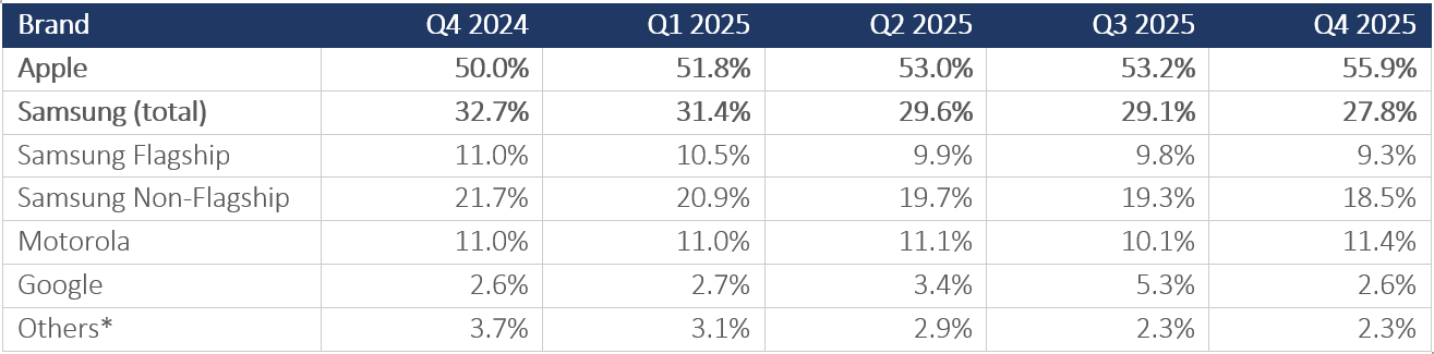
The headline is blunt: Apple ended 2025 with 55.9 percent of the US installed base, up 5.9 points in a single year. Samsung fell 4.9 points to 27.8 percent. The gap between the two brands, 28.1 points, is now 62 percent wider than it was twelve months ago. Five consecutive quarters of directional movement, with share gains accelerating rather than moderating, is consistent with a structural realignment rather than a cyclical fluctuation. The 2026 upgrade data will be the definitive test. The market share here is the installed base of over 104,000 US consumers, whose device information was passively collected during the survey. While we believe the data is robust, with a 0.3% margin of error (95% CI), the market share may still differ from the traditional shipments-based market share. The quarterly market-share trends based on the installed base provide a more directional analysis of the market than an absolute one.

Table 1.1: Quarterly Market Share Trends (% of Installed Base)

Note: *Others include OnePlus, LG, TCL, Xiaomi, Nokia, BLU, and remaining brands. Source: Recon Analytics US Mobile Device Components survey, Q4 2024–Q4 2025.

The Ecosystem Trap Nobody Can Escape

Apple is not winning on specs. The iPhone 17 series ships with a smaller battery than leading Android rivals. Its camera array does not top the industry benchmarks. What Apple has built instead is a gravitational field: iMessage, AirDrop, FaceTime, and the seamless handoff between iPhone, iPad, Mac, and Watch. Switching away from Apple does not just mean buying a new phone; it means abandoning a digital life. No hardware specification can compete against that.

The data confirms what Apple’s own marketing has long implied: its best salesperson is a current iPhone user. Friends and family recommendations ranked as the top research source for Apple buyers every single month across the May–December 2025 tracking period. No paid media budget can replicate a word-of-mouth engine that runs entirely within an installed base of 150 million-plus American consumers.

Samsung’s Two-Brand Problem

Here is the part of the Samsung story that most competitive analyses get wrong: there is no single Samsung. There are two, and blending them together produces numbers that are wrong for both.

Samsung Flagship, the Galaxy S, Z Fold, and Z Flip series, averaged $1,056 per device in Q4 2025 (Recon Analytics US Mobile Device Components survey, Q4 2024 – Q5 2025). That is $69 above Apple’s average of $987. Samsung’s premium users are paying more than iPhone users. The Galaxy S and Ultra command high customer satisfaction, with a flagship satisfaction score (cNPS) of 32.4 (n=37,302, May-Dec 2025), compared to Apple’s 30.4 (n=107,406, May-Dec 2025). Note: the 2.0-point gap between these scores sits at the cNPS noise threshold; confirm subgroup-level margin of error before asserting a directional lead. The component net promoter score (cNPS) is Recon Analytics’ proprietary version of the NPS. Recon Analytics’ cNPS covers smartphones from 22 dimensions. Also, 64.4 percent of the Samsung flagship installed base is now in the 2-plus-year upgrade-eligible window. That is the most financially concentrated upgrade opportunity in Android heading into 2026.

Then there is Samsung Non-Flagship, the Galaxy A-series, averaging $243 per device in Q4 2025, down sharply from $316 a year ago (Recon Analytics US Mobile Device Components survey, Q4 2024–Q4 2025). Its satisfaction score (cNPS) sits at 22.3, with 26.9 percent of users actively detracting from the brand. The A-series does not just underperform; it creates potential brand-perception drag that shadows every Samsung consumer evaluation. The $813 gap between Samsung’s two tiers is the starkest within-brand pricing divide in the market.

The consideration data makes the structural problem concrete. Samsung Non-Flagship buyers cross-shop Apple at a higher rate than Samsung Flagship buyers, 23.1 percent versus 20.5 percent (Recon Analytics US Mobile Device Components survey, May-Dec 2025; Samsung Non-Flagship, n= 32,263, and Flagship n=37,302 respectively), and that gap widened through the second half of 2025. Whether this reflects an aspirational pull toward Apple specifically or the generally higher brand fluidity among value-tier buyers is a distinction the consideration data raises but does not fully resolve; both mechanisms likely contribute.

Google Ran an Experiment. The Results Were Not Encouraging.

Google’s 2025 is a case study in the difference between rented share and owned share. Pixel climbed from 2.6 percent of the US installed base in Q4 2024 to 5.3 percent in Q3 2025, driven by carrier promotions and the launch of the Pixel 10. By Q4 2025, it was back at exactly 2.6 percent. Exactly where it started. The precision of that reversion is striking.

The hardware was not the problem. Google Pixel Pro earned the highest device-level satisfaction score (cNPS) in the entire dataset, 33.2 cNPS, with the lowest detractor rate among all flagship-tier devices. The product genuinely converts buyers into advocates. The challenge is that Pixel advocacy operates largely outside the physical environment where most purchase decisions are finalized. Pixel devices appear on carrier websites, but are underrepresented in the physical store, according to Recon Analytics’ survey data (see upcoming Consumer Device Purchase Journey – Part 3 report), 53 to 55 percent of US device sales through carrier and big-box channels are driven by in-store staff recommendations, floor placement, and promotional subsidies — not web listings. A phone can be available online and still be invisible at the point of conversion. That is Google’s distribution problem: not absence from the catalog, but absence from the moment that matters.

Google’s 2025 trajectory is the reference point every brand strategist in this market should keep close to. A promotion without a plan for what happens when it ends is a subsidy, not a growth strategy.

Motorola Does Not Get Enough Credit

While the industry fixates on the premium tier, Motorola has quietly done something harder than it looks: hold ground. The brand maintained 11.0 to 11.4 percent share across all five tracked quarters, with a consistent Q4 seasonal lift driven by holiday gift purchases. Its average device price runs around $313 to $333, flat across the year, with no pretensions toward premiumization. Motorola’s franchise is built on carrier placement and price discipline, and it executes that positioning with a consistency that belies its unglamorous reputation.

The satisfaction picture is mixed: non-flagship CNPS at 20.7 (cNPS), with 28.6 percent detractors, suggests elevated hardware quality friction at the low end, but the brand’s structural stability in a year when Samsung shed nearly 5 points is nothing.

The Upgrade Pipeline That Will Define 2026

Here is the question that makes 2025’s data genuinely consequential: what happens to the upgrade cycle next year?

Apple’s 51.9 percent upgrade-eligible rate, applied to its dominant installed base, produces the largest absolute pool of upgrade-ready consumers in the market. Samsung Flagship’s 64.4 percent eligible rate, though applied to a smaller base, represents the single most financially concentrated upgrade opportunity in Android. The two pools together define the 2026 replacement market.

Samsung’s most immediate strategic decision is whether it converts that aging flagship base before Apple does. Galaxy S users are holding devices longer than any other tracked segment and are currently cross-shopping Pixel as their primary Android reference point rather than iPhone. That is a narrower competitive window than most Samsung strategists probably assume. If Samsung can capture the upgrade cycle with its own flagship base, the share-loss story changes. If Apple absorbs another wave of premium converts, the 28-point gap could widen further.

The data does not predict outcomes. But it tells you exactly where the pressure points are, which side has the momentum, and which brand’s growth is real. Right now, Apple has the momentum. Google has the product but not the shelf. Samsung has two businesses that need two strategies. And Motorola has quietly survived a year that was much rougher than the headline numbers suggest.

The 2026 upgrade cycle is loaded. Whoever takes it may well determine whether this is a structural realignment or a temporary gap. The thesis that this is a structural shift, not a cycle, has three observable tests. First: if Samsung Galaxy S26 captures more than 55 percent of its own upgrade-eligible base in Q1-Q2 2026, the share-loss momentum is arrestable. Second: if Apple’s installed base reaches 58 percent by Q2 2026, the shift is accelerating past Samsung’s realistic recovery window. Third: if Google’s share holds above 3.5 percent through Q2 2026 without a promotional event, it has converted rented share into owned share for the first time. Any one of these outcomes materially changes the 2026 forecast.

Note: This analysis covers the US smartphone installed base from Q4 2024 through Q4 2025. It does not address global market dynamics where Samsung’s competitive position differs materially; carrier incentive structures that drive short-term share movements independent of brand preference; or price elasticity effects that may account for some portion of Apple’s installed base growth. These variables are available for analysis in subsequent phases of the device-purchase-journey study. If you want to find out more about the Recon Analytics’ US Consumer Device Purchase Journey Part 1: Market Landscape, Brand Performance & Consumer Satisfaction report, which is based on 104,408 US respondents tracked from Q4 2024 through Q4 2025, please visit here: US Consumer Device Purchase Journey – Part 1: Market Landscape, Brand Performance & Consumer Satisfaction – Digital Product Reports